
Columns Level
Each row consists of one or more columns, and each column contains widgets and elements. Columns are one of the most important pieces of your layout to understand in order to have sites that look good across mobile, tablet, and desktop devices.
Add New Columns
There are two ways to add new columns. The simplest way is to duplicate a pre-existing column by clicking the “Copy” button in the side menu bar. Once you have duplicated a column, you can change the widget and element within the new column to create something different.
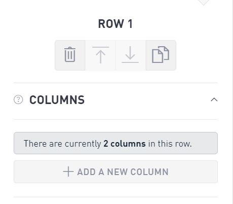
You can also add a column within the Row menu. Within the Row menu, select Columns and click “Add a new column.” Do this as many times as you need to achieve the desired number of columns within your Row.
Sizing
When you open up the Sizing menu, you will see a grid of XS, SM, MD, and LG with 12 boxes next to each. These boxes specify how wide the column that you have selected is.
XS is the width on vertical mobile layouts
SM is the width on horizontal mobile layouts
MD is the width on vertical tablet layouts
LG is the width on horizontal tablet and desktop layouts
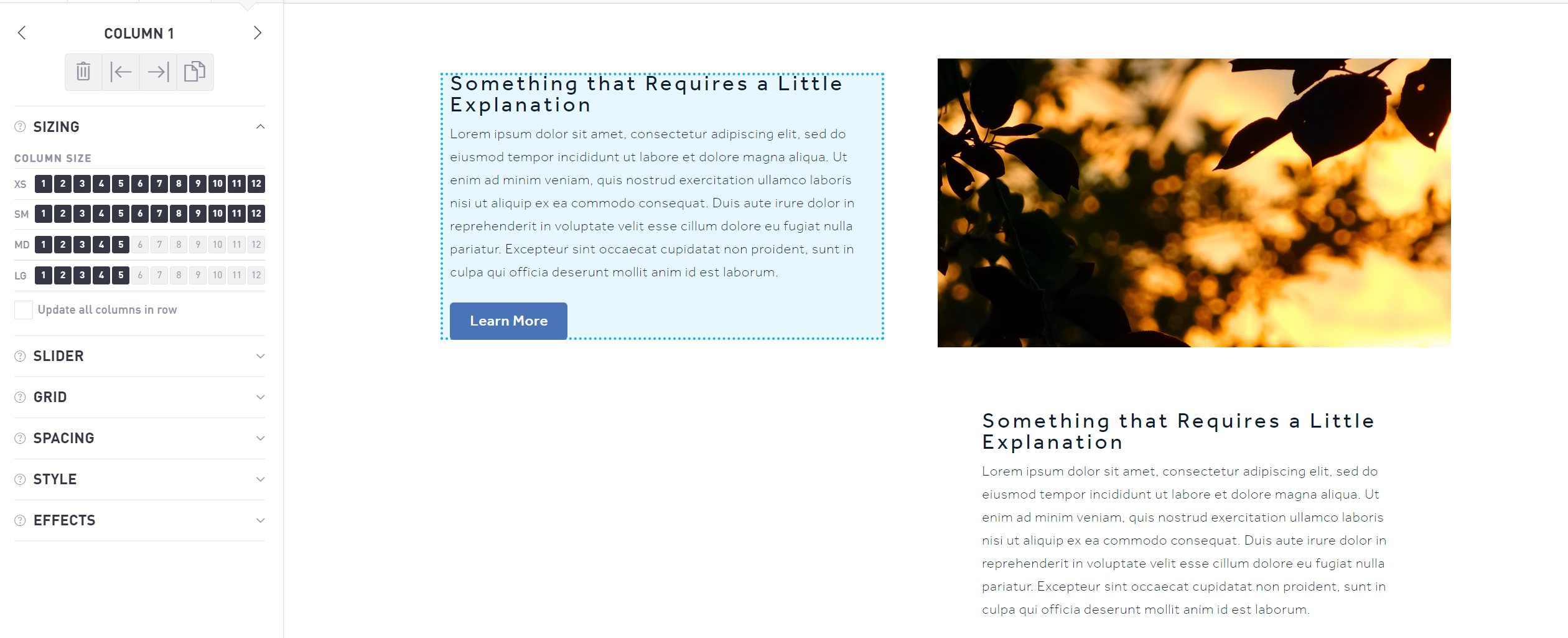
Each page is composed of 12 sub-divisions (also called columns, but not to be confused with the Column object you are working with). Each of these sub-divisions represents 1/12 of the horizontal width of the page. 12 boxes creates a column that is 100% the width of the page. 3 boxes creates a column that is 25% the width of the page, so you can have 4 items side by side.
Sizing Example
If you have all 12 boxes selected, your column will be the width of the entire page no matter what device you view your page on. This is ideal for headers that should span the full page.
If you have XS and SM widths set to 12 and MD and LG widths set to 6, your column will span the whole screen on a mobile device, but it will only take up half the page on a tablet or desktop layout.
If you want to have a series of items side-by-side on a page, create columns that are 2, 3 or 4 sub-divisions wide. On mobile layouts (XS and SM), you might want to make each item take up 6 sub-divisions (2 across), while a desktop (LG) could have room for 4 across in the same space, which would be 3 sub-divisions.
As a rule, you should always be using the same or more boxes in your XS and SM layouts than your MD and LG layouts. While there is no “perfect formula,” err on the side of readability for all layouts.
What About Height?
Your widget will automatically scale its height based on how wide it is and the widgets and elements inside.
Slider
The slider is particularly useful for rotating images, such as social media widgets or rotating banners. Toggle the Slider on or off using the radio buttons underneath the slider option. For static images, keep the slider set to “off.” To rotate between a series of social media posts or images, select “on” and designate how many images you want to appear for each device (see Sizing, above).
Grid
Turn on the Grid functionality to automatically stack the widgets within a column into a grid formation. In order to use this function, you must have more than one widget in a column. Once the grid function is toggled to “on” you can choose how many “responsive columns” you want inside the current column. You can also choose to add another grid element.
Spacing
Control the column spacing by adjusting the padding. You can edit the padding individually for mobile, tablet, and desktop views. Adjust the top, bottom, left, and right side padding by incrementing numerically. The default interval is 10 pixels.
Style
The Style section allows you to choose whether your widget snaps (or aligns vertically) to the top, middle, or bottom of your column container. Advanced users can add additional CSS classes within this section as well.
Effects
Use effects to apply custom transitions to the column. You can have a column transition in or out as someone scrolls down the page. Click the “+” next to either In Animation or Out Animation and choose from the supplied list of animations.
Effects can be used to great effect on a homepage, but steer clear of overusing them to create the best user experience.